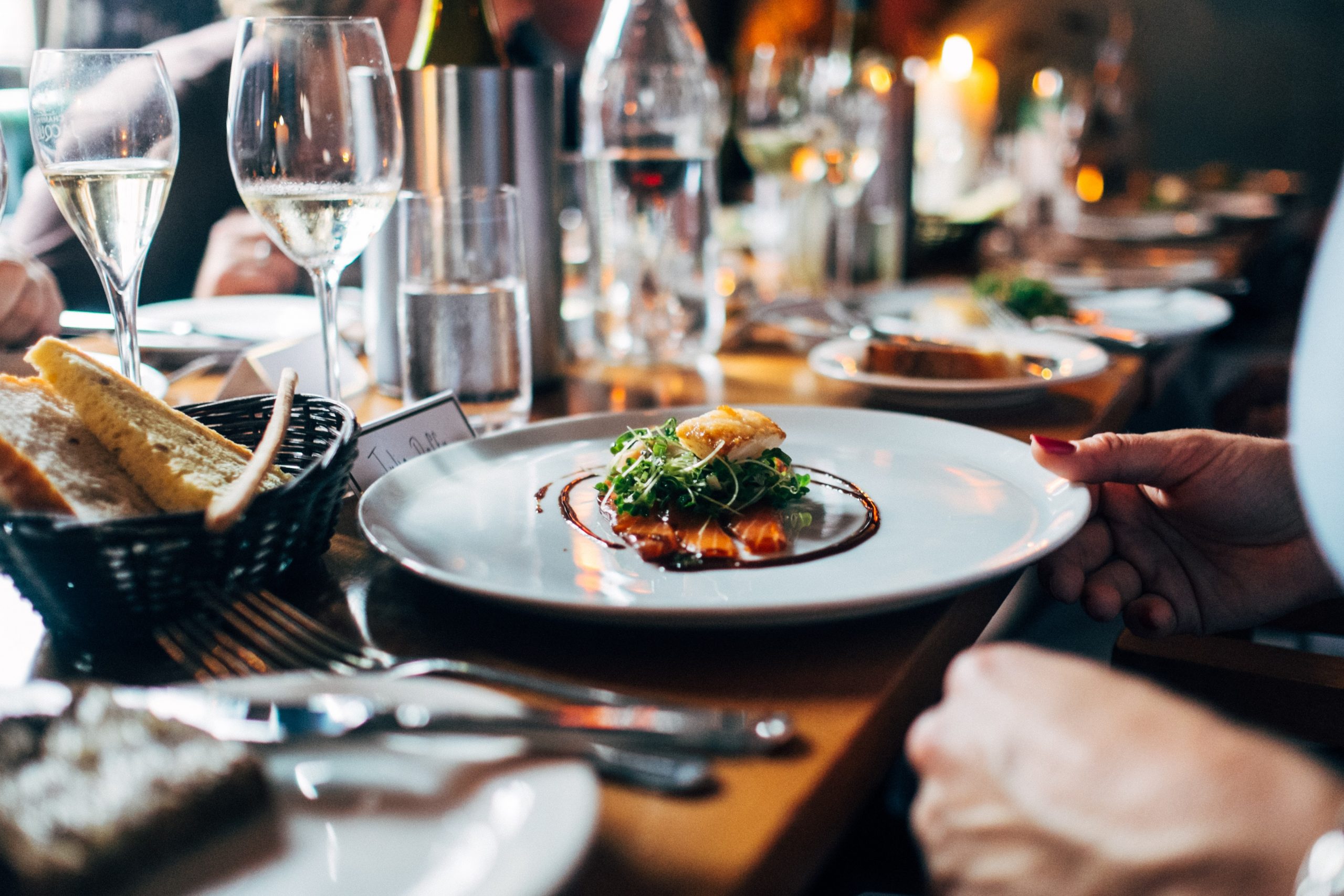
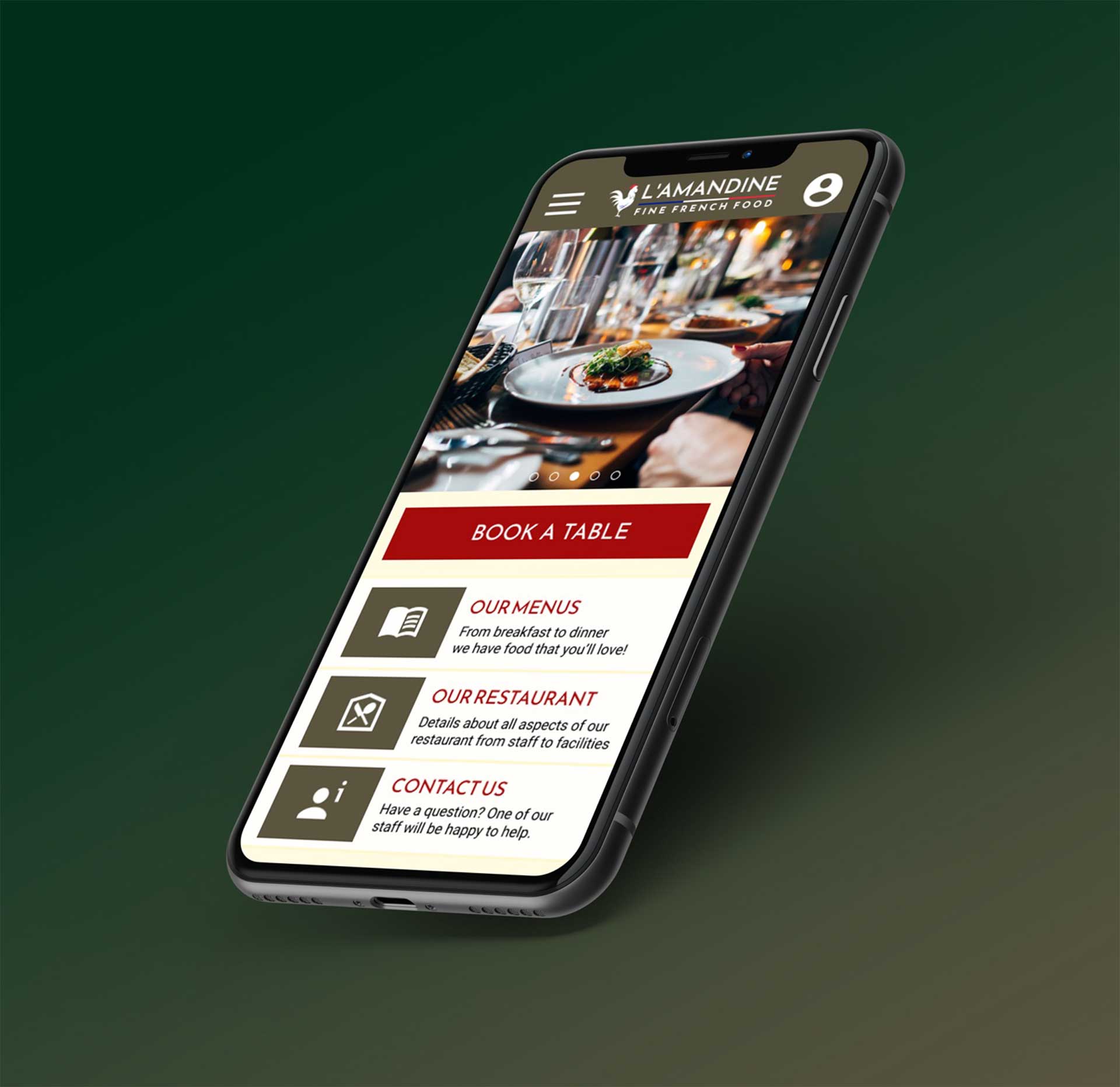
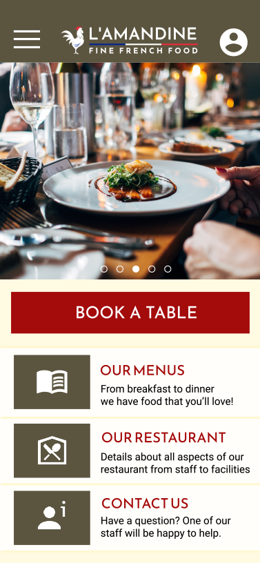
The product:
A scheduling app for a local French restaurant for customers to book a table and make bespoke requests on seating and personal requirements to their booking.


A scheduling app for a local French restaurant for customers to book a table and make bespoke requests on seating and personal requirements to their booking.
Around five months worth of work from November 2021 until April 2022.
Customers were unable to book a table at their favourite French restaurant via an app. They currently need to either call by in person or telephone to book.
To design an efficient and useful scheduling app for the restaurant that benefits both the user and the restaurant staff in saving time and adding extra convenience.
UX designer in charge of the project and deliver on the goal of producing an app to cater for scheduling requirements.
User research, wireframing, prototyping, usability group testing, iterating on the design based on the testing, high fidelity designs and prototypes, further testing, iteration and final deployment.
Users wanted a simple interface for easy booking. Users had experienced difficulty with other restaurant booking systems because of complexity or poor design.
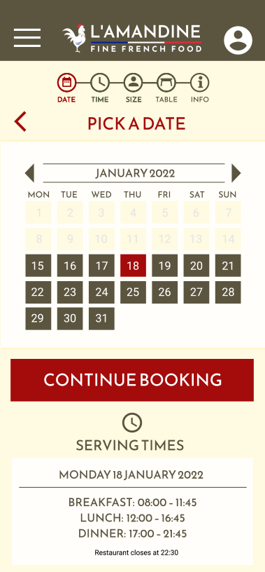
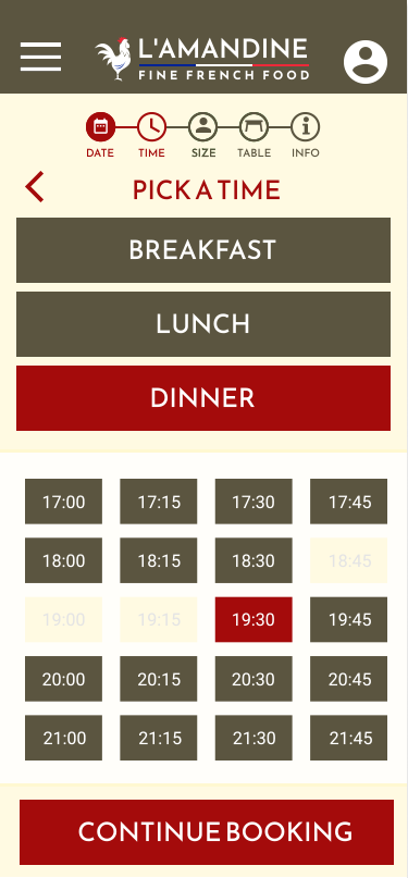
Booking systems identified as overly complex and can be a long process. Users wanted quick booking for those with busy lives.
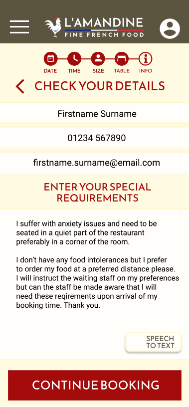
Those who have special needs find it difficult to use booking systems or don’t provide adequate opportunity to cater for specific requirements to a particular booking.
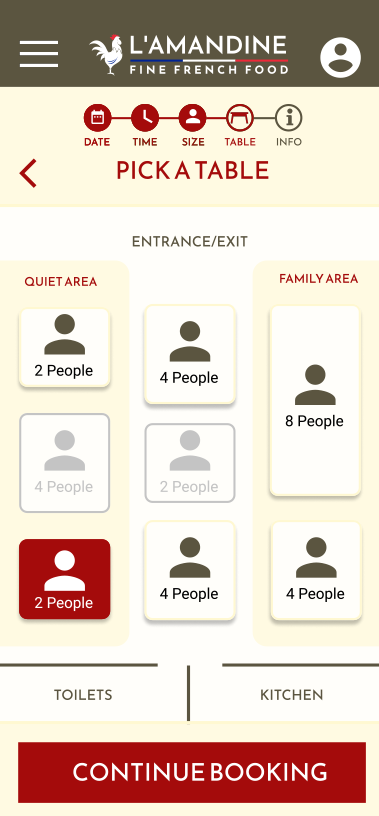
Users identified that seating choice (similar to a cinema or theatre) is often not provided by most scheduling apps.
The goal was to make a fully accessible app in order to book a table at the restaurant without requiring assistance from those with special needs unless it is specifically requested in the process (for example confirming booking details and clarifying any points the user may have about the venue or food.
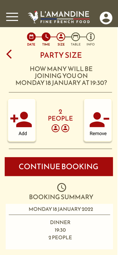
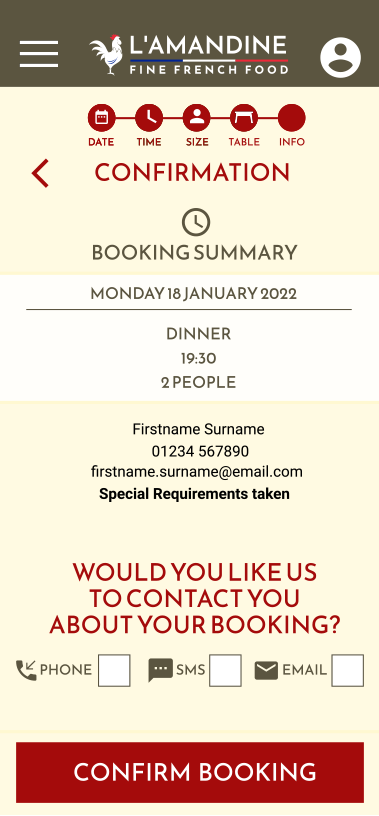
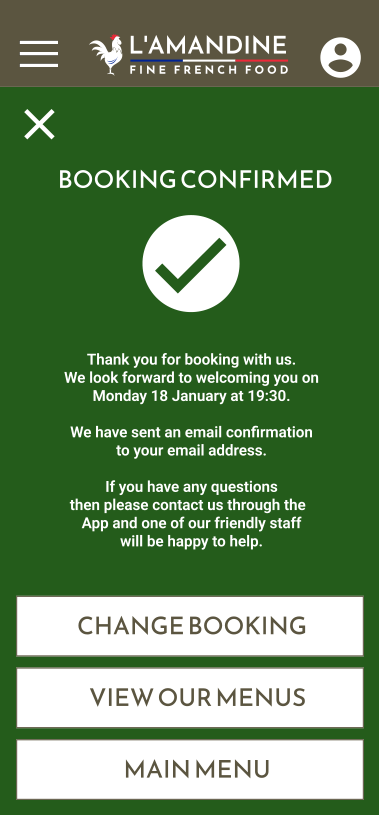
The goal was to create a quick and simple process to book a table at the restauarant using simple Call To Actions (CTAs) and speeding up the process going forward by means of setting up a user account.
For colour use I chose a dark green and deep red for CTA buttons. The usability study however highlighted that the colours were giving the impression of an Italian restaurant rather than French. I altered the green to a neutral dark warm grey. So the accent colours stand out but kept the deeper red.
Clear and consistent colours that comply with accessibility design standards.
Text to speech ability in the app for those who have issues with using a keyboard and need to convey special requirements to the restaurant.
A call back function using a communication method which is chosen by the user to best suit their needs or preferences.
Consider the accessibility further by having the ability to increase or decreasing text sizes within the app.
Explore additional elements within the app such as the user account and also look into discounts implementation into the app.
Explore ways to enhance the seating plans to better reflect the restaurant and if table arrangements change within the site and how this change could be implemented quickly on the app.